Making sense of data
— 3 min read
There is very low friction to get data from a system, but making sense of that data may be difficult. Somehow, having a lot of data is similar to having none.
For a customer I'm currently working on, we started an activity with a question: how many travel solutions aren't available for sale on our digital channels?
This may be similar for an eCommerce to ask how many SKUs are searched by users who can't buy them because they are out of stock? or for a news site, how many internal links are broken or pointing to out-of-date articles?
With this question in mind, we started collecting more accurate data on the log level. This may be accomplished also with a good analytics setup.
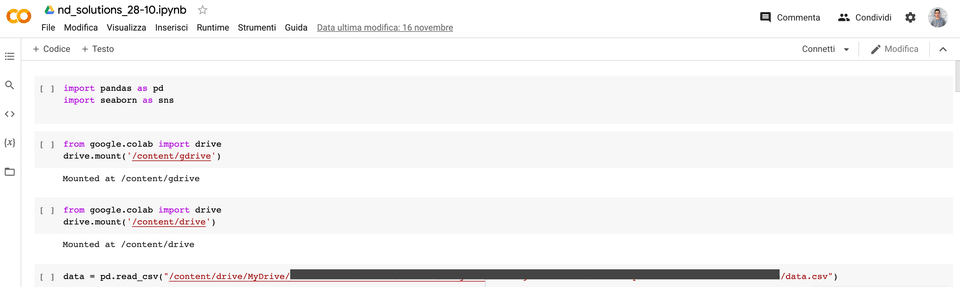
Kibana offers the possibility to generate a CSV report of a query. This data has been uploaded on Google Drive and imported into a Google Colab notebook.
Even if it doesn't feel like the magic of the collaboration on a document or spreadsheet, Google Colab is a step forward in providing custom data analysis tools to the team.
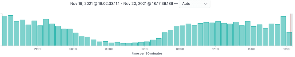
Once loaded, the dataframe has been explored to find out the volumes of unsaleable travel solutions on a daily basis.
We went to progressively explore the factors that contribute to unsalability. The interesting thing was that some elements that we had initially considered as the culprits, in reality, were not the main motivations.
With the help of Pandas and Seaborn libraries, we have created some charts and packaged a report to discuss it with different stakeholders. After taking various inputs and investigating some aspects of the domain with our customer, we made a new round of analysis focusing on the most sought-after routes for a certain product category. From there, it emerged that some routes marked as unsaleable could be fixed and made available, thus increasing the usefulness of the digital channel for purchasing and increasing sales.
The advantage of this notebook-based approach is the ability to freely explore data and create a history of blocks of code that can be reused to track the reduction in the number of unsaleable solutions over time. This result could probably have been obtained with excel, but through the code, the following advantages can be obtained:
- the development team is more comfortable using this tool for their analysis
- Excel tends to quickly become a tangle of complex formulas of which it is easy to lose the original meaning
- we mainly use google spreadsheet, and with large volumes of data, it it doesn't hold the shot and processing can become slow and frustrating
- the notebook can be converted into a script or run automatically in a pipeline with updated data with Papermill.
It has been a fun and valuable activity for the business, often the focus is on the purchase funnel and sales volumes. In this case, we went to explore a less obvious path that with some tweaks can lead to benefits for the user.
Many thanks to Javier Fernandez for the help in setting up the pipeline and all the exploration activities.